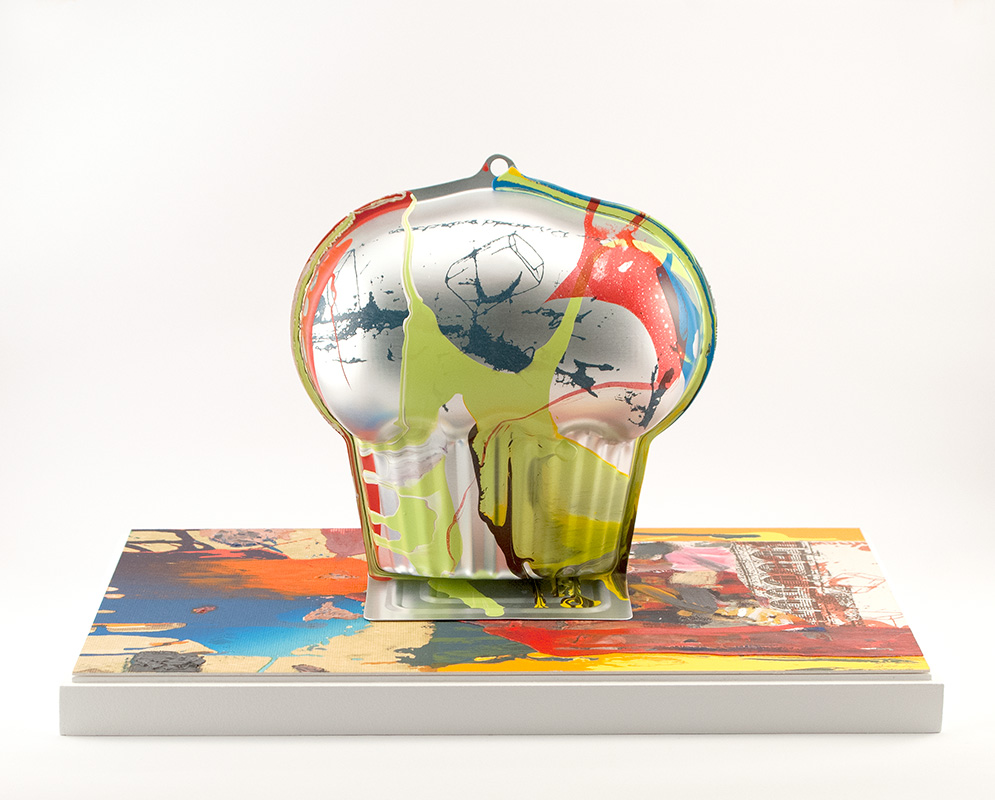
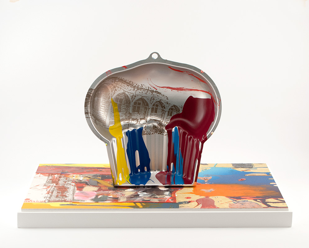
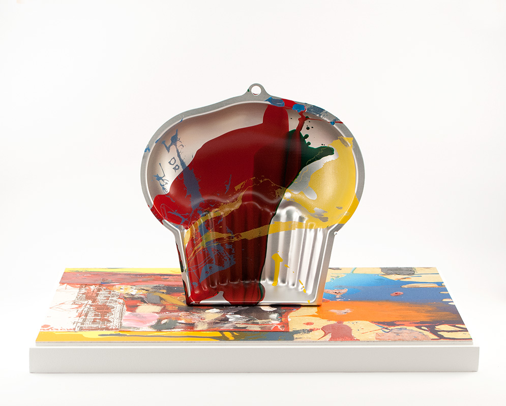
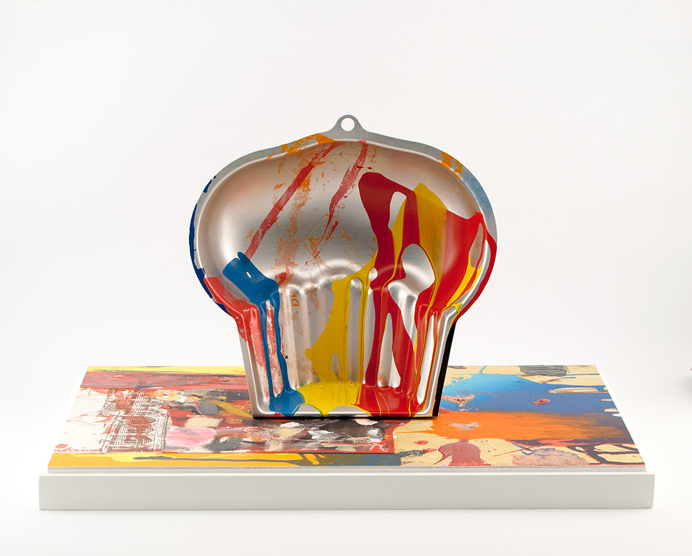
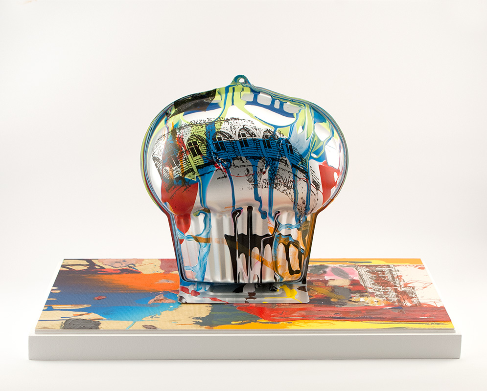
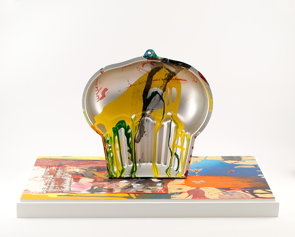
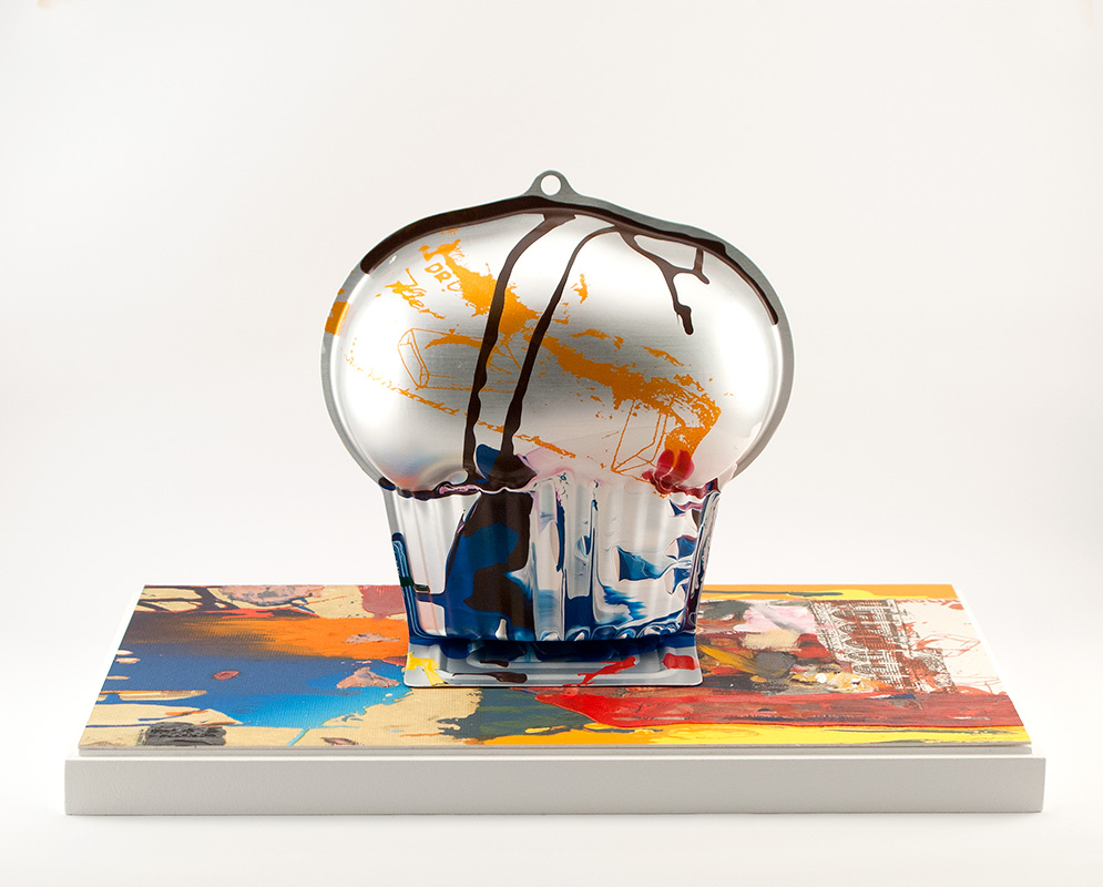
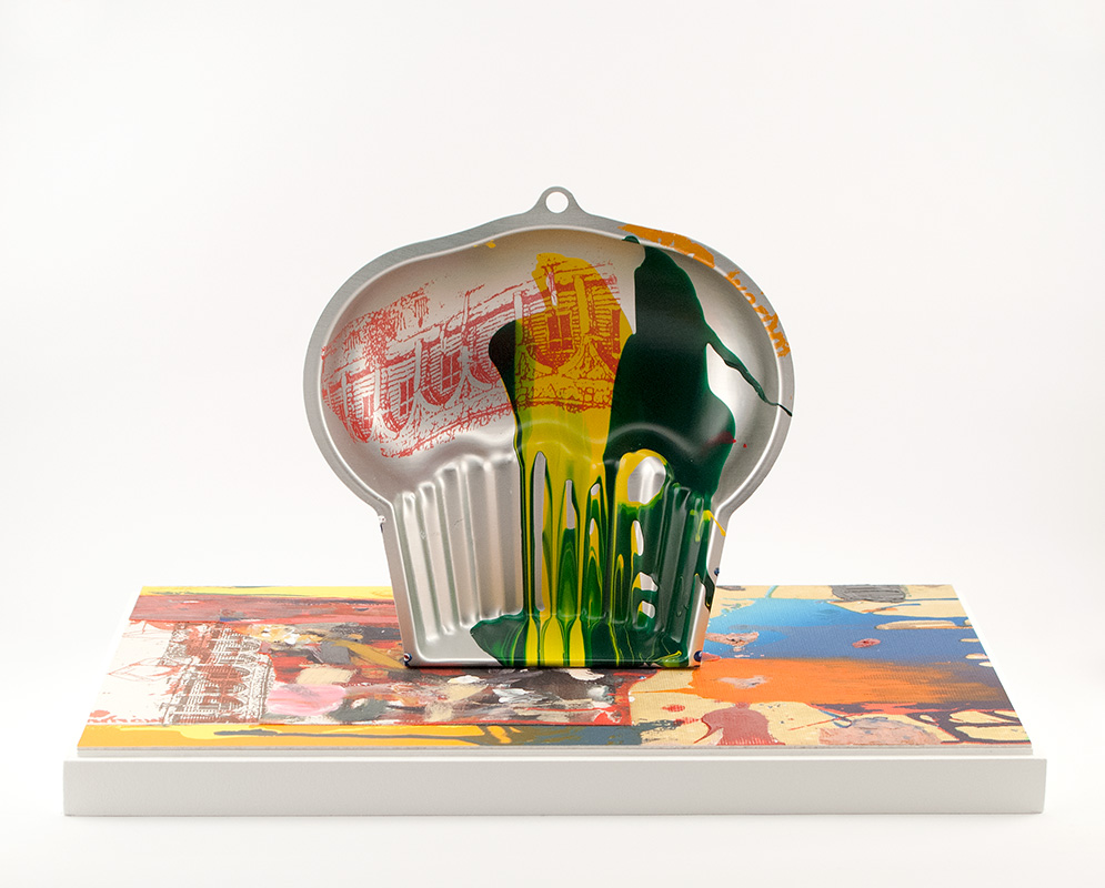
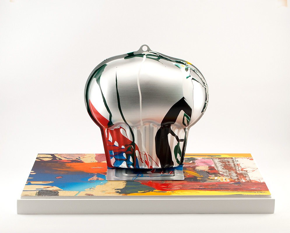
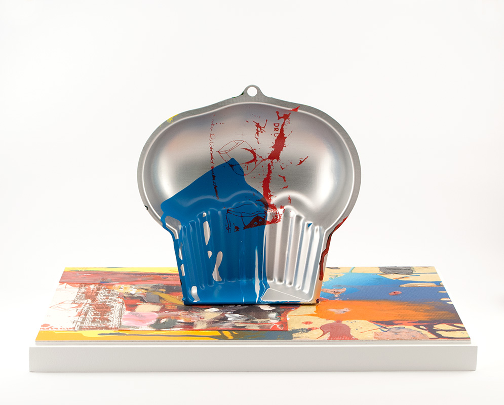
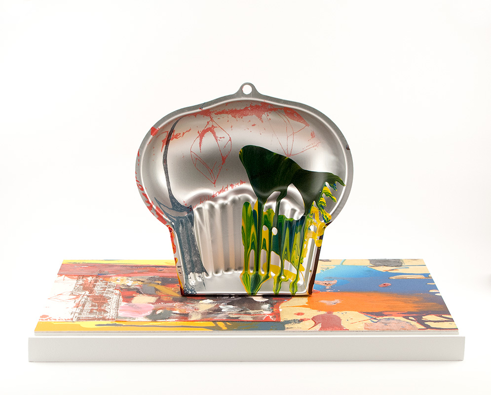
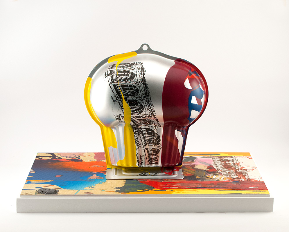
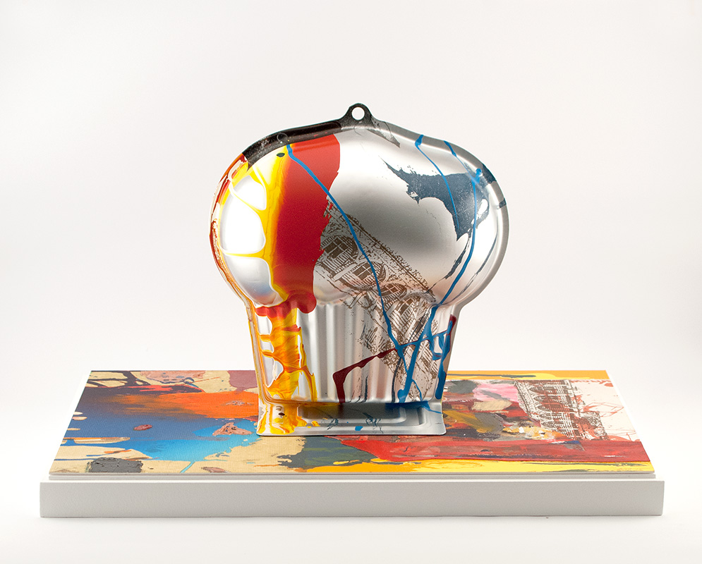
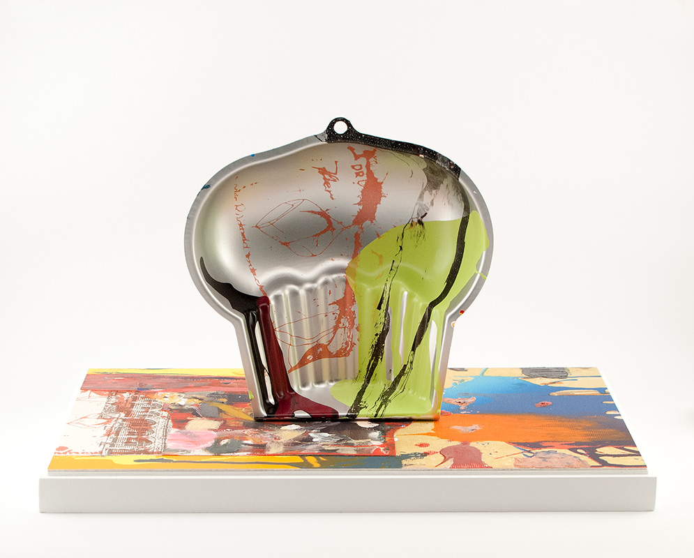
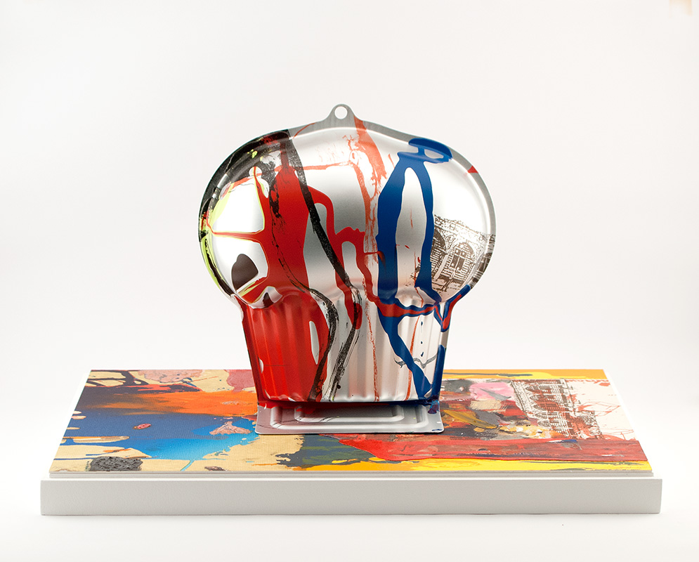
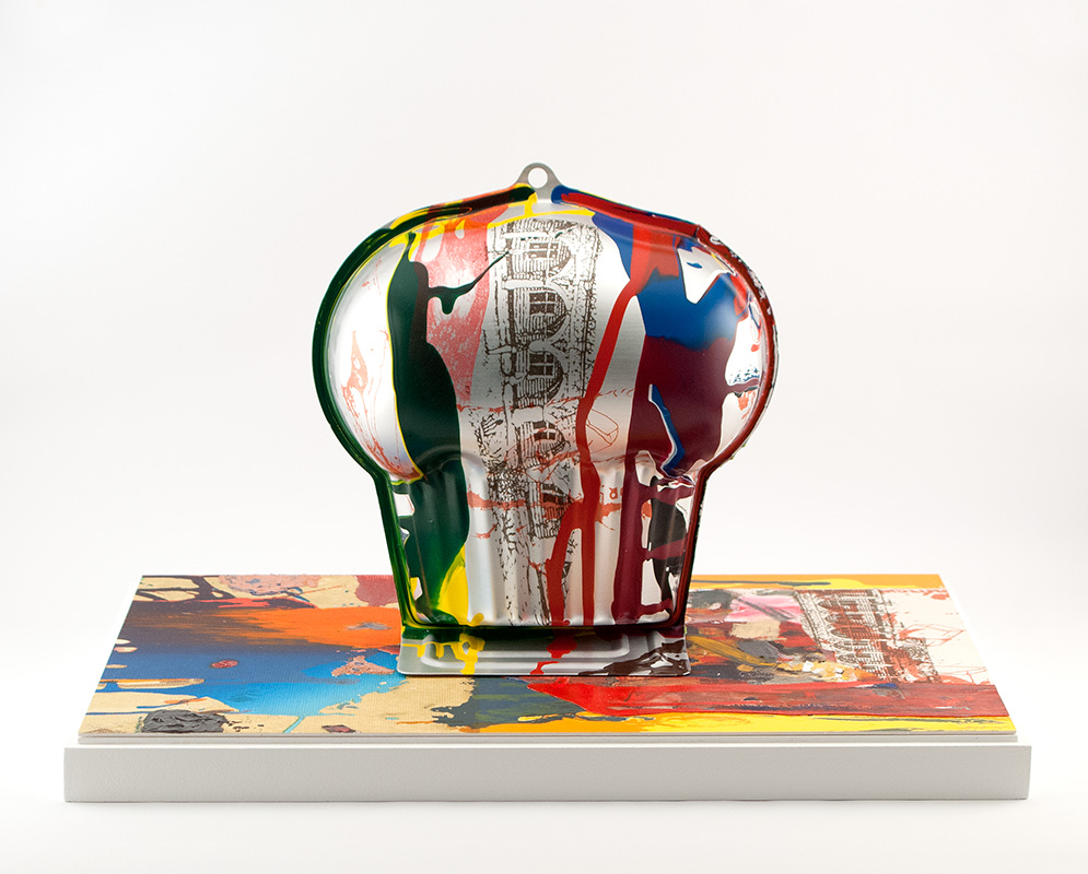
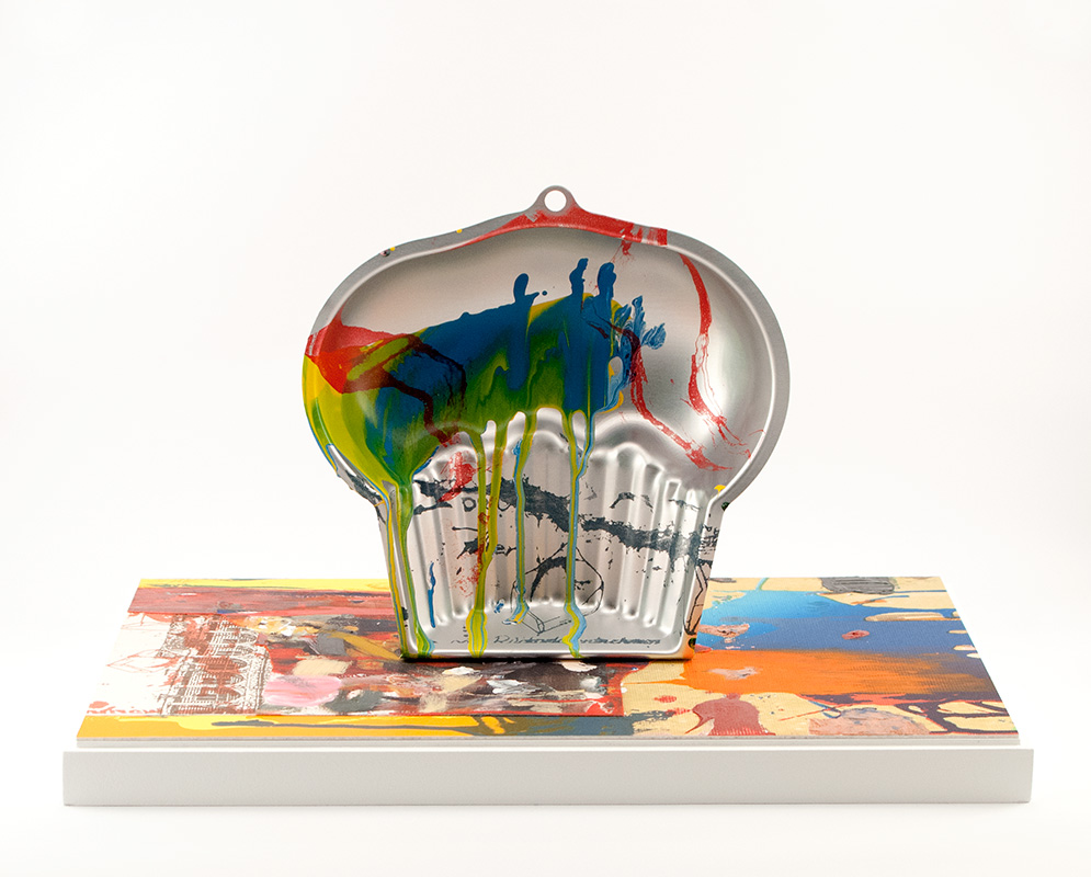
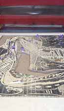
Arturo Herrera, 'Bang' (2015)
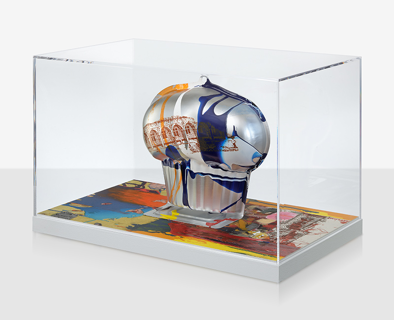
Bang (2015) (Impression number: 1/15, front view)
Edition: 15** Variable edition.
Full set of images and detailed information about the work HERE. (.pdf download) Click HERE for a curatorial text.
Hand lithography on BFK Rives 250g, on canvas and on linen; Collage mounted on museum board;
Water transfer printing and enamel paint on aluminium; Hand applied lithography ink and acrylic paint.
48 cm x 29.5 cm x 33.6 (incl. pedestal and plexiglas case)
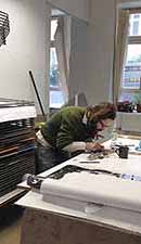
Printed by Ulrich Kühle and Sarah Dudley with assistance by Gabrielle Paré and Annelies Kamen
5,798.32 € net / 6,900.00 incl. V.A.T. Purchase this work >>
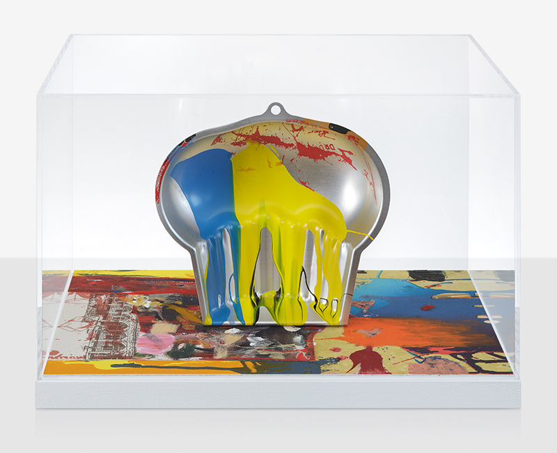
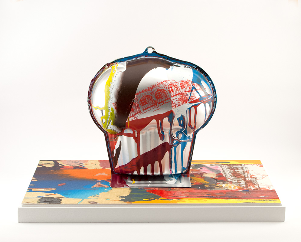
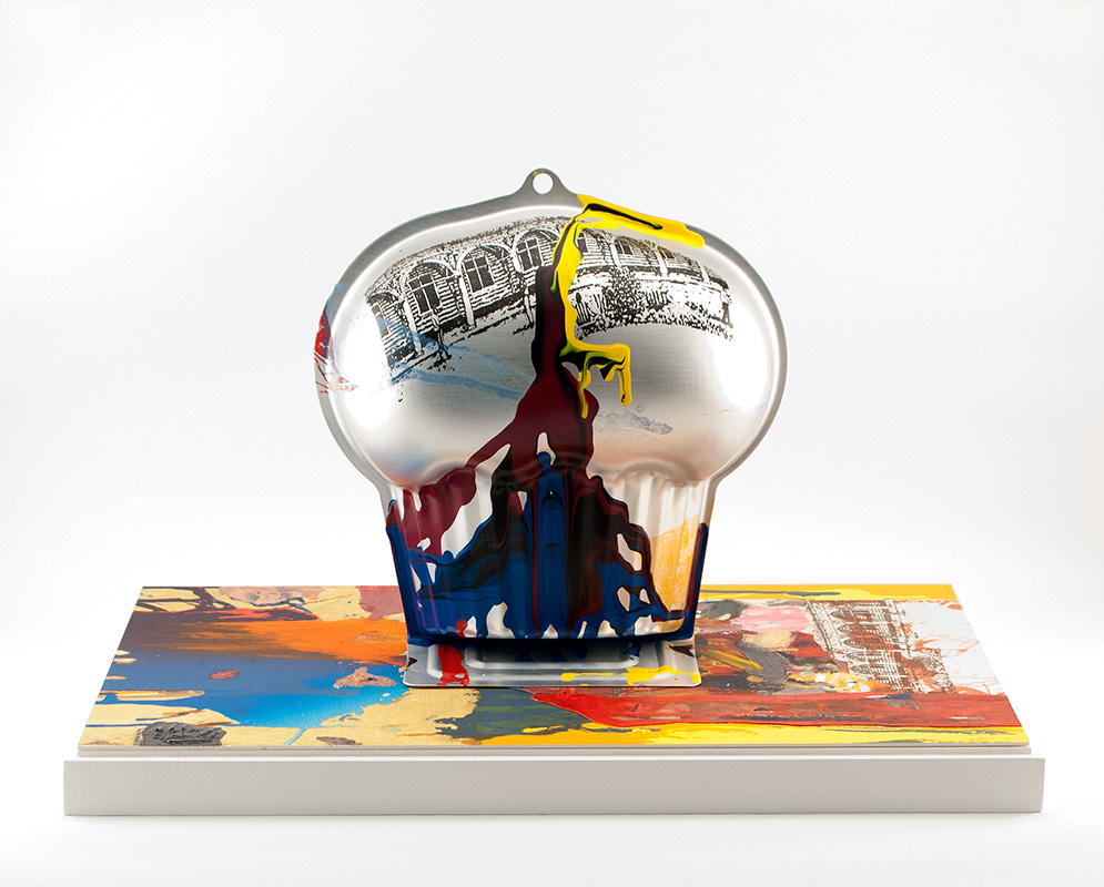
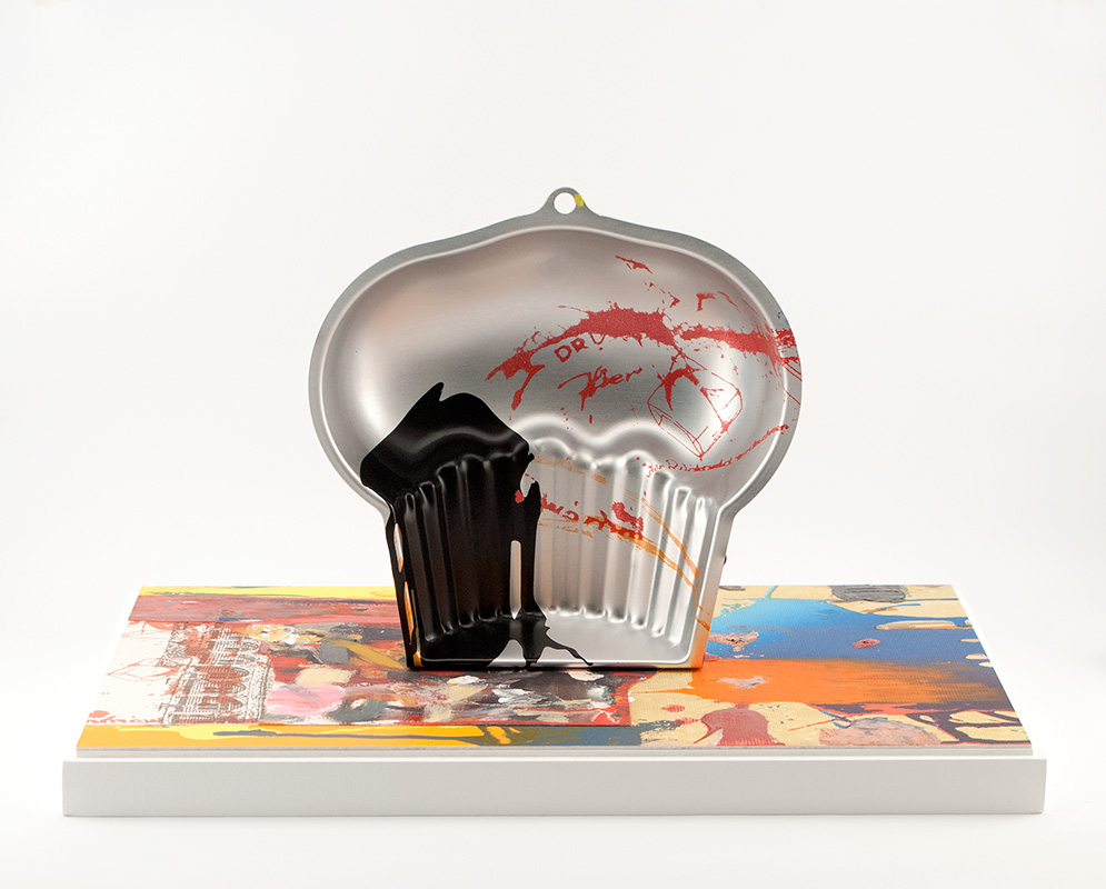
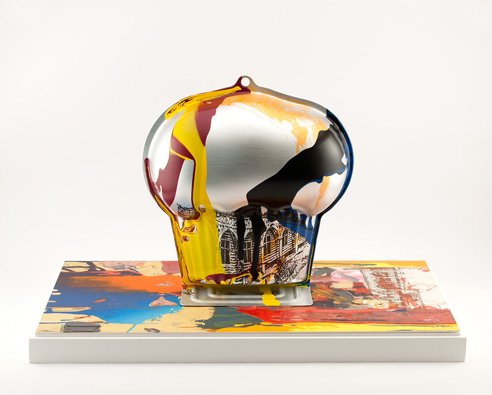
Arturo Herrera 'Bang' (2015) Impression number 1/15 (back view) Photo: Gunter Lepkowski
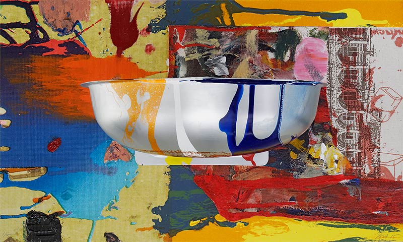
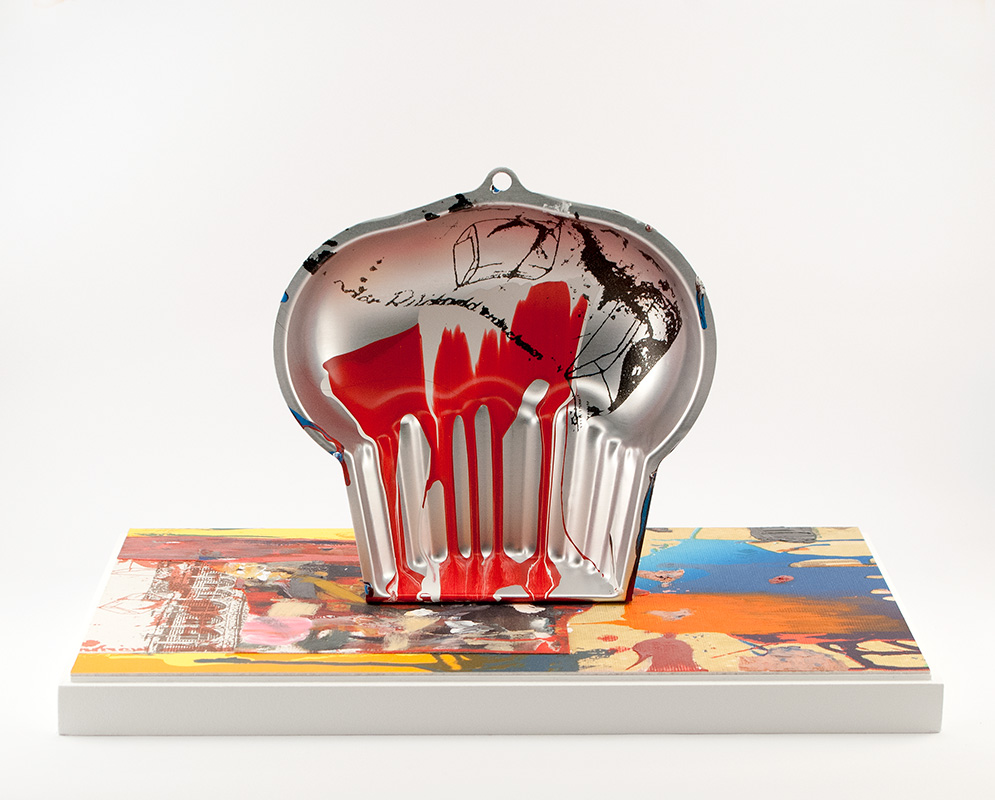
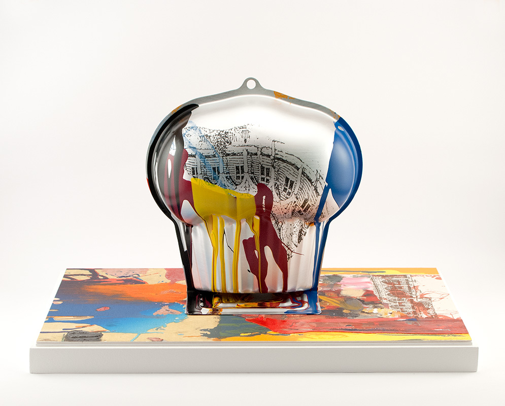
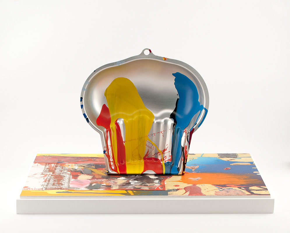
Arturo Herrera 'Bang' (2015) Impression number 1/15 (view from above) Photo: Gunter Lepkowski
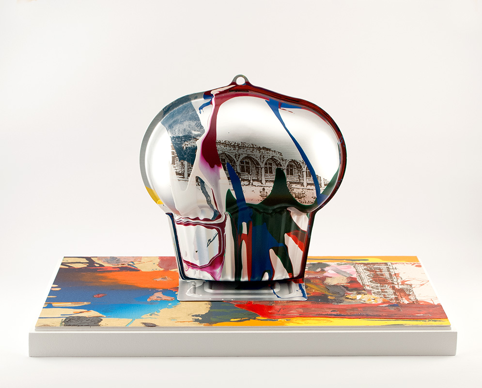
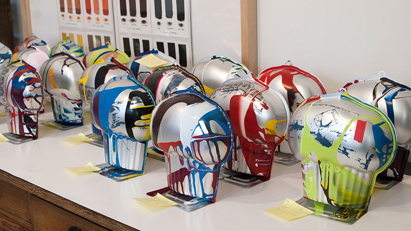
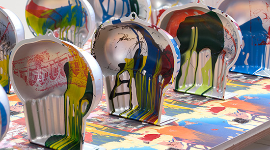
Perhaps the most exciting feature of these works is the unique combination of multiple layers of water transfer prints with enamel paint on the aluminium forms. Herrera worked with the printers to define the variations on each individual form, choosing colours and images that reference the 2-dimensional print which serves as the base of the work. While each form is unique, the lithograph base is consistent over the edition.
 |
 |
 |
 |
 |
 |
 |
 |
 |
 |
 |
 |
 |
 |
 |
 |
 |
 |
 |
 |
 |
 |
 |
 |
 |
 |
 |
 |
 |
 |
Work in progress...
For his editioned work Bang, Arturo Herrera collaborated with the printers at Keystone Editions to experiment with the possibilities for interaction between sculpture and printmaking.
The colourful composition which serves as the base of the work is a collage composed of various printmaking techniques layered upon different materials. Although printed in a consistent edition, the painterly marks display a direct, spontaneous quality. While the lithographic process generally guarantees the uniformity of an edition, Herrera’s hand-applied printing ink brushstrokes introduce an element of the individual to the piece. The predictability of print is thereby expanded and complemented by a moment of play and spontaneity.
Centrally-placed upon the print is an aluminium baking pan. Images were ‘printed’ onto the metal form employing a technique new to fine art printmaking and used for the first time in a Keystone Editions project. Known as ‘water transfer printing’, the image is printed onto a clear film which is then transferred onto the object by means of a water bath. By manipulating the movement of the water, the images could be individually distorted and adapted to the aluminium shape.
The resulting unique prints emphasise the principles of variation and randomness as essential formal considerations. This interplay between control and chance in the creative process is further reflected in the free application of dripped enamel paint, which also establishes a harmonious connection between the various elements in the complete work. The culmination of these ideas and processes is an object, that while providing the surface for print and colour also retains its sculptural quality. The painted and printed baking pan, a mass-produced ‘readymade’, becomes a unique work in itself that carries the signature mark of the artist’s hand.
Due to a mutually complementary interfusing of the various techniques, the edition Bang is characterised by the appearance of simultaneity, providing multiple readings. The lithographic base is expanded by the concave/convex shape of the metal pan. This juxtaposition encourages an essential tactile dimension and a sense of defined yet open space that can be experienced from different perspectives.
Text: Ferial Nadja Karrasch
English Translation: Sarah Dudley
Rollin Beamish
Engineering of Consent (2015)
Edition: 40 (2 states, 20 impressions each)
76 cm x 56 cm, printed on Somerset white satin, 250g
Printed by Sarah Dudley
American artist Rollin Beamish creates stunningly beautiful drawings which he places in compositions with elements laden with socio-political significance. For his first lithograph, he created a portrait of Edward Bernays, the original Spin Doctor. He worked for many governments and corporations as a PR consultant and was instrumental in propaganda campaigns during WWI. One of Bernay's better-known 'achievements' was to overturn the taboo of women smoking in public, so as to open up an entirely new market for the American tabacco industry. At the time, women caught smoking outside designated areas could be arrested.
This image was editioned in two versions: one in the rich dark brown and the other printed with transparent ink and finally dusted with mother-of-pearl powder. The irony of combining 'glitz' and uncomfortable truths is of course entirely intentional and only serves to make the message that much more poignant. On both versions of the edition, Beamish added hand drawing and image transfers, making each impression a unique work.
The pearlescent pigment captures the detail in Beamish's drawing
with incredible accuracy and metamorphoses from negative to positive according to lighting conditions. Have a look-->
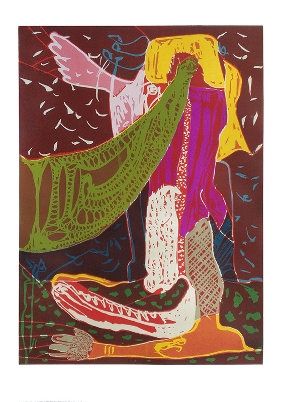
Woodcut by Peter Linde Busk
You must lead the Dance with me, the Letter of Indulgence will not help you. You much dance to my Pipes (2014)
Edition: 18 + 2 A.P.
141 cm x 99 cm, printed on Zerkall Alt Mainz white, 300g
Printed by Ulrich Kühle with assistance from Nina Dine and Gabrielle Paré
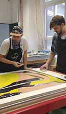
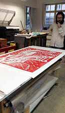
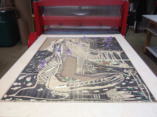
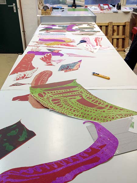
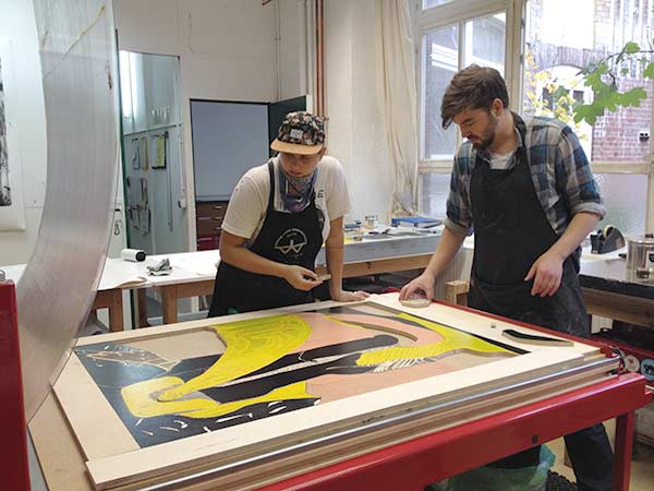
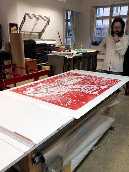
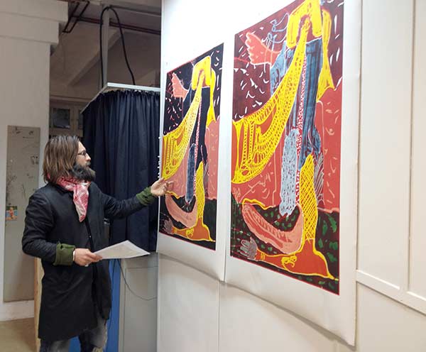
Danish artist Peter Linde Busk was back with us, working on a large-scale woodcut for his 2014 shows in Copenhagen and London.
Our printers enjoyed the challenges of working with the 46 puzzle-pieces that make up the second plate for this
print, as well as editioning
the entire print on a litho press.
The print comprised four layers: red overall, the 46-pieces individually inked, blue over the large hornpipe shape and finally a transparent
grey over all. Click the images below for views of the proofing stage. Click HERE to see the final print.
But first, enjoy an entertaining time-lapse video
of editioning the puzzle-piece layer:
 |
 |
 |
 |
 |
 |
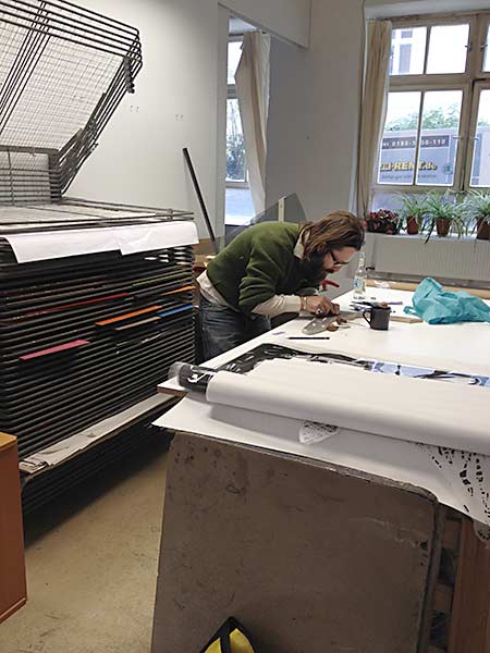
Brigitte Waldach - dusting prints with powdered graphite
The Gap Between Past and Future (2014)
Editions: 40 + 5 A.P.
76 cm x 56 cm, printed on Canson BFK Rives white, 250g
Printed by Sarah Dudley with assistance from Ulrich Kühle, Gabrielle Paré and Nina Dine
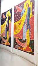
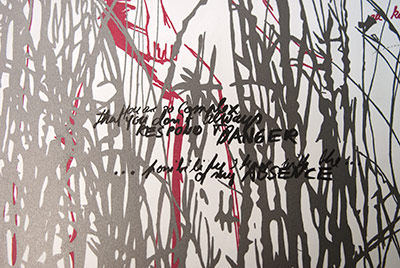
These two editions examine Hannah Arendt’s literary work entitled “Thinking”. The primary focus of this piece is “Where are we when we think?”. The first of this pair of lithographs shows a female figure moving through a graphite grey grassy meadow in an, as yet undefined, white future. The second image swaps the white background for a black one creating a visual echo of the first motif. The figure stands within a landscape,
the „black“ past behind her. The landscape merges slowly into the background. Words are floating in both times, future and past.
Each image has been printed in an edition of 35, yet each impression is also unique, as after printing was completed I added individual phrases from a chapter of the book. The two pieces can be seen as a diptych but they stand equally alone. If we were able to look at these complete editions as a combined whole, we would have my personal summary of the chapter „The Gap between Past and Future“ from Hannah Arendt’s essay “Thinking”.
-- Brigitte Waldach, February, 2014.
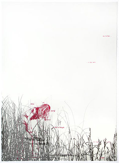
The Gap Between Past and Future (Future)
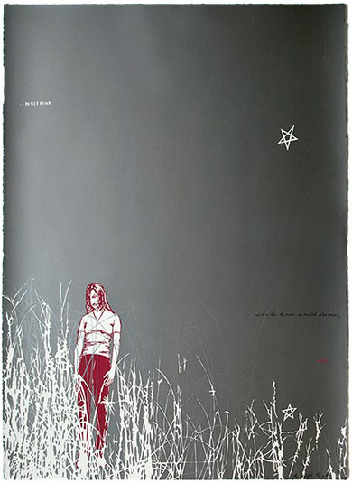
The Gap Between Past and Future (Past)
The technical side of this project directly challenged all of our previously-held beliefs about how one goes about dusting prints with dry pigment. Firstly, we had always thought that the ink layer to be dusted must also be the last to be printed. Second, we had never seen a near full-sheet
flat dusted with pigment, much less with another layer printed on top which also had to be dusted with pigment. Needless to say, it was
extremely satisfying to discover that all of these 'rules' were just asking to be broken.
Run order for image 1 (Future): Red; Black/Graphite; black text. (All photo plates)
Run order for image 2 (Past): Red split roll; Black/Graphite; White/mix of Graphite and mother-of-pearl. (All photo plates)
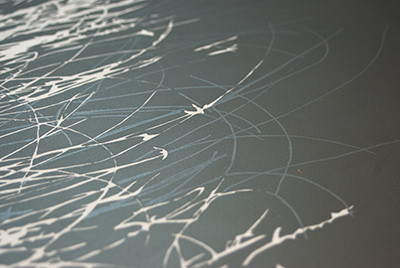
On Brigitte's second image we were faced with dusting the entire background with pigment. As far as we know, this hadn't been done before so we needed to be inventive. In order to maximise our chances at getting the flat perfect, free of any unwanted marks, we built an extra wide brush that could cover the entire sheet.
As with the first image, we prepared the prints for the third and final run by cleaning off all excess pigment. We printed the next drawing from a photo plate, in white ink which did get quite dirty from pigment offset. However, this wasn't a problem as we were going to cover this ink in pigment as well. Every 5 prints we cleaned the photo plate with FPC to remove the built up offset pigment. The final layer of pigment was a 12:1 mixture of graphite and mother-of-pearl, to contrast with the background.
send us an email or visit us on Facebook.
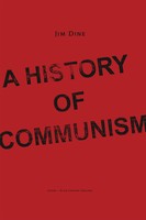
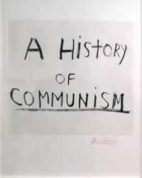
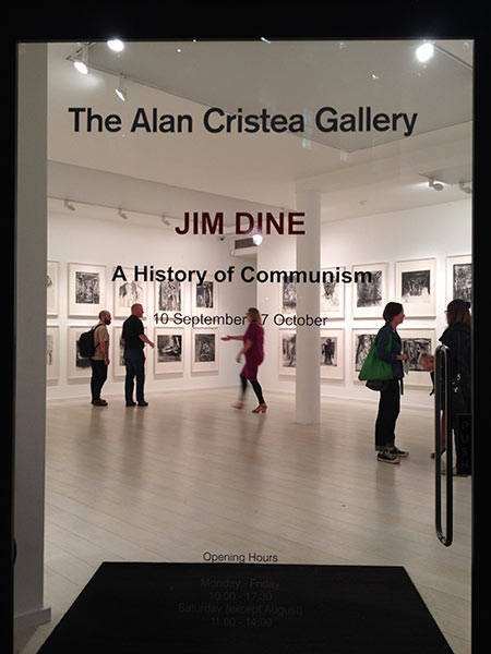
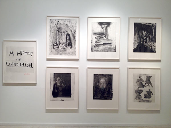
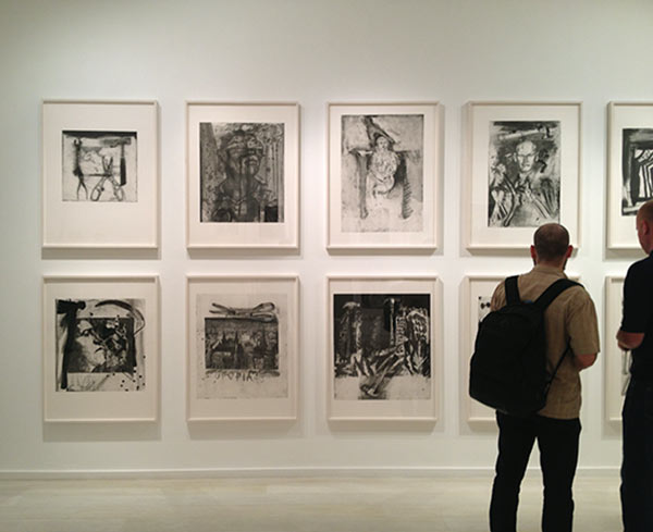
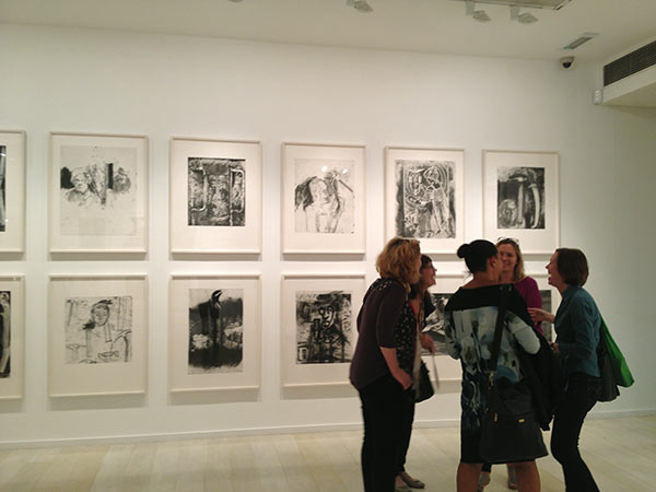
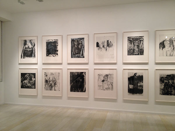
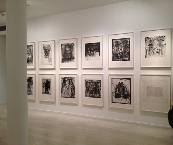
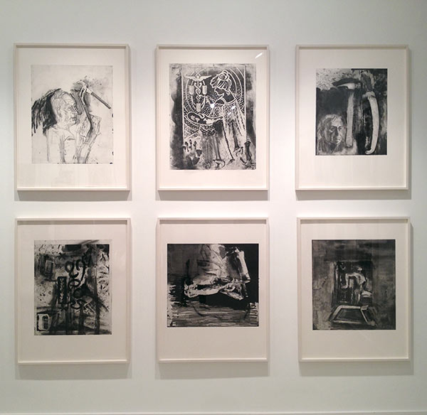
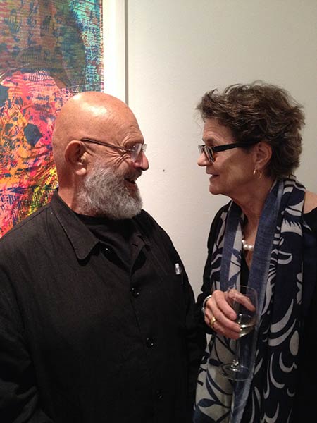
Jim Dine "A History of Communism" official launch in London
On the 9th of September, the Alan Cristea Gallery launched the latest work by Jim Dine. This series comprises 45 separate images, inspired by drawings on old stones that were found in a former studio building in the Montbijoupark in Berlin-Mitte (previously East Berlin). The Weissensee Art Academy's lithography workshop used to be in this building and at some point while the city was still divided, nearly 100 stones were put in storage in a basement room. The building was scheduled for demolition in 2011 and while moving everything out, litho workshop manager Johannes Witt discovered the long forgotten stones, which Keystone acquired.
Jim Dine combined intaglio printing with the lithographs to create a set of completely new and impressive images. It was an internationally collaborative project: Keystone printed the lithographs, Julia D'Amario printed the etchings in Jim's workshop at his house in Walla Walla, Washington and Bill Lagatutta of Tamarind Institute in New Mexico printed the title page. The catalogue can be ordered directly from German publisher Gerhard Steidl: www.steidl.de Click the images below to order the catalogue or to see photos of the exhibition in London.
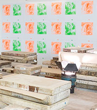
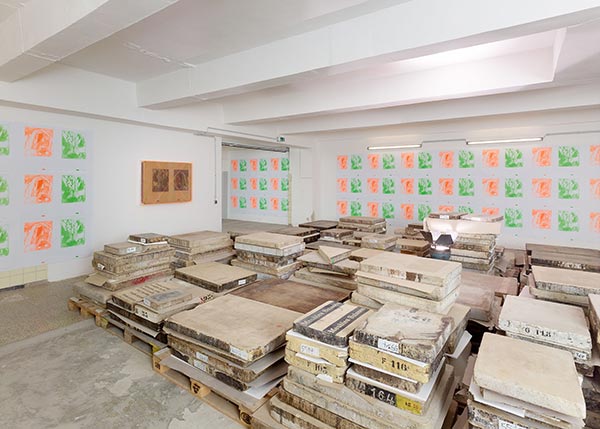
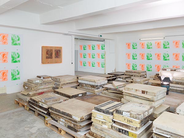
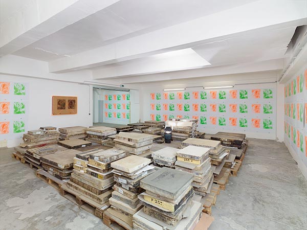
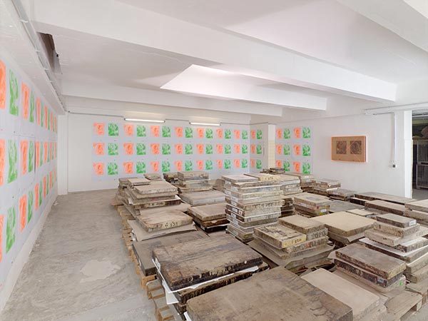
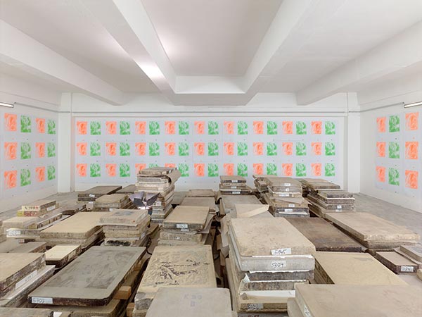
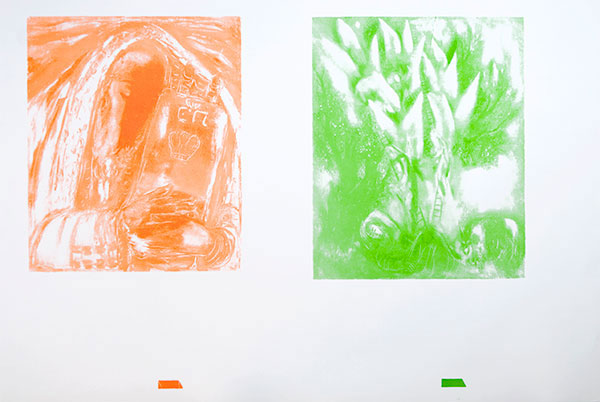
Dieter Detzner „Saxa Loquntuur‟
in 2012, Berlin artist Dieter Detzner became the happy new owner of a jaw-dropping number of beautiful litho stones. Despite their age, some of the images on these old stones can still be printed, including some images by none other than Marc Chagall. Detzner had the Keystone printers reprint one of Chagall's stones in a double-dose of neon ink. His intention was to cover the walls of his stone storage space with the prints, for his latest Installation „Saxa Loquntuur‟ (the stones speak). On the 24th of May, 2014, Detzer opened the exhibition which also showcased the impressive pile of remaining stones from his collection. On the wall, contrary to any sense of logic and housed in a orange plexiglass case, hung the rather large litho stone that was used to print the neon images- Detzner transformed the stone into a work of art itself, transcending its former function as 'merely' the support for two-dimensional images. Click the image below to see photos of the installation.
© 2016 Ulrich Kühle Sarah Dudley GbR • All rights reserved.